DESIGN HINTS & TIPS
The best signs that leave our workshop are those that:
a) We have been well briefed on.
b) Had a constructive meeting with the client that merge their ambitions & our recommendations.
When briefing or planning your sign consider:
Colours | Fonts | Sizing | Logos | Illumination
All vital in achieving a great sign that effectively appeals to your target audience with good visual impact.
Think about:
Adding illumination to your sign board
“Stick Out” Signs for projecting your brand
Pavement Signs for promoting products & services
Eye-catching Window Graphics & Vinyl’s
Awnings & Canopies
Internal Wall Logos, quotes, art, shapes & lettering
Moving signs - Don’t forget about branding your vehicle it’s a 24/7 means of advertising to attract new business
Take inspiration from multinational leading high street brands. They utilise all aspects of signage & recognise the importance of branding from external signage & pavement signs to window lettering & internal branding. All hammering home a brand experience & keeping your business one step ahead of the competition.
We have a purpose built design studio with examples of the range of signage we offer.
Feel free to come in anytime to see our work & to discuss your sign package. Call us on 01992 553004
HERE ARE SOME SIMPLE POINTERS
Fonts / Lettering:
There are literally 1000’s of fonts available to use don’t be put off by this. The font you choose is paramount in creating the right impression of your business. The 5 main font categories are as follows:
TIMES
BLOCK
CASUAL
Script
IMPACT
Research fonts that best reflect your brand, image & ambitions. Another key consideration is the spacing between letters, this should always be consistent with sufficient negative space to ensure clarity.
Layout:
Good layout is vital it welcomes the reader of the sign to its message.
The sign has an optical centre; this is very slightly above the actual centre & where the main message / body of lettering should be positioned. This message should then be surrounded by sufficient negative space. This brings balance to the layout of the sign. A good layout will also limit the number of lettering styles. We advise 2 as a general rule of thumb.
Colour:
Choose contrasting colours that work well together. A dark background with light lettering or a light background with dark lettering is key to achieving a legible sign that stands out for the right reasons. We recommend if illuminating to use white lettering on a busy high street, white night-time illumination works best.
Simplicity is key! Try not to get bogged down with attempting to be so different, our advice is stick to the basics & do them well incorporating slight variations & twists
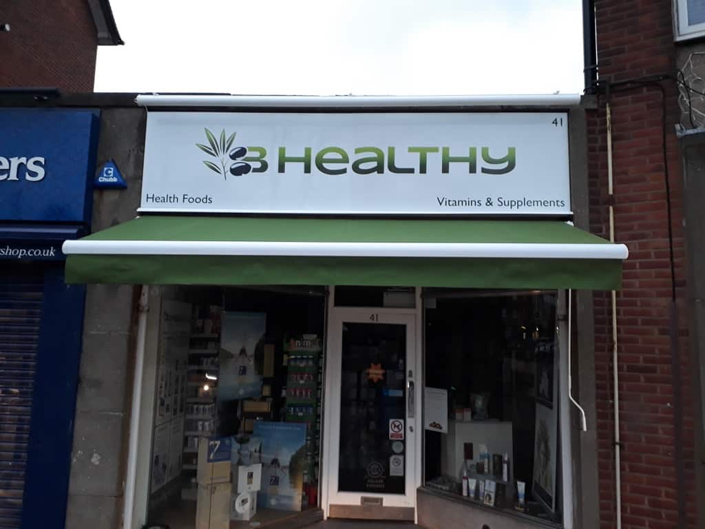 Sign Design Hints Tips 01 East Herts Signs
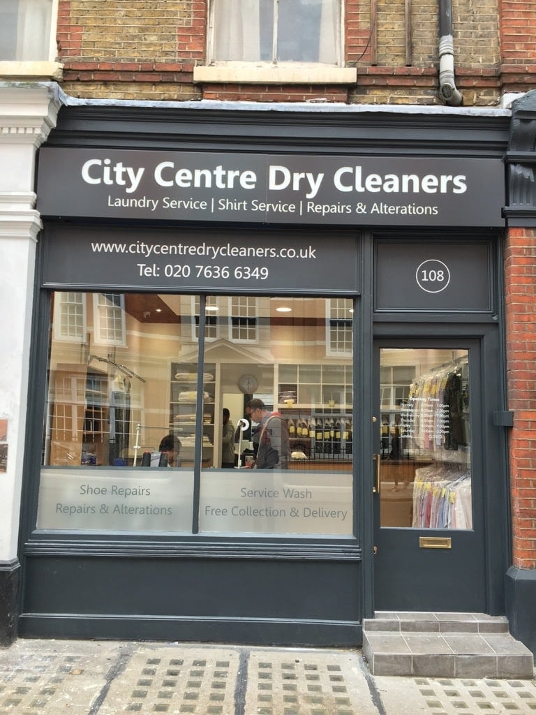 Sign Design Hints Tips 02 East Herts Signs.
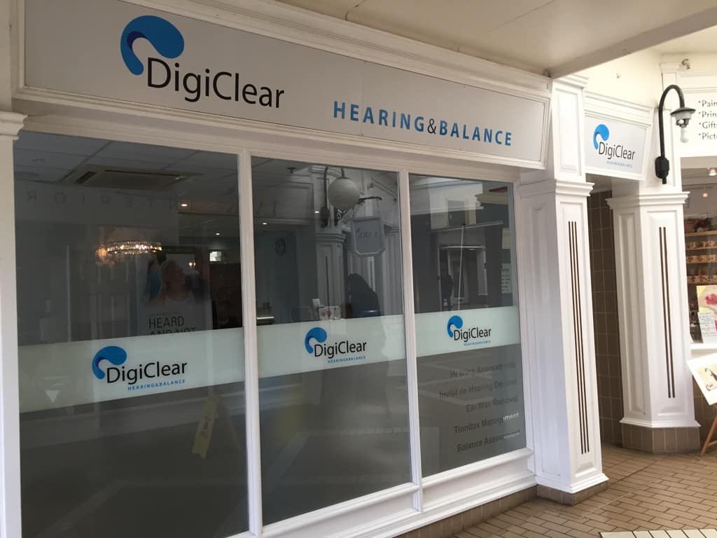 Sign Design Hints Tips 03 East Herts Signs.
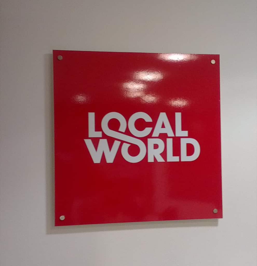 Sign Design Hints Tips 04 East Herts Signs.
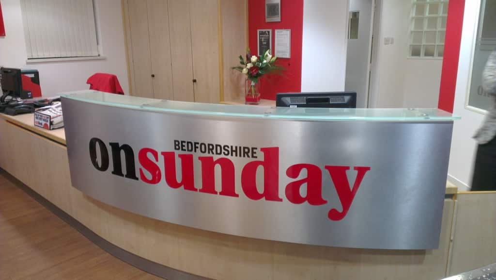 Sign Design Hints Tips 05 East Herts Signs.
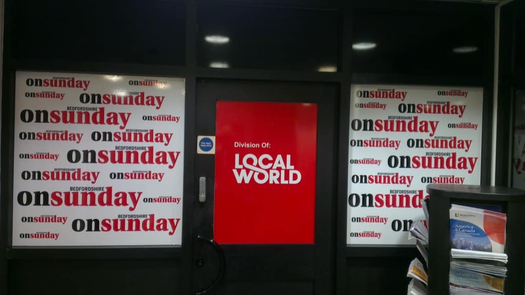 Sign Design Hints Tips 06 East Herts Signs.
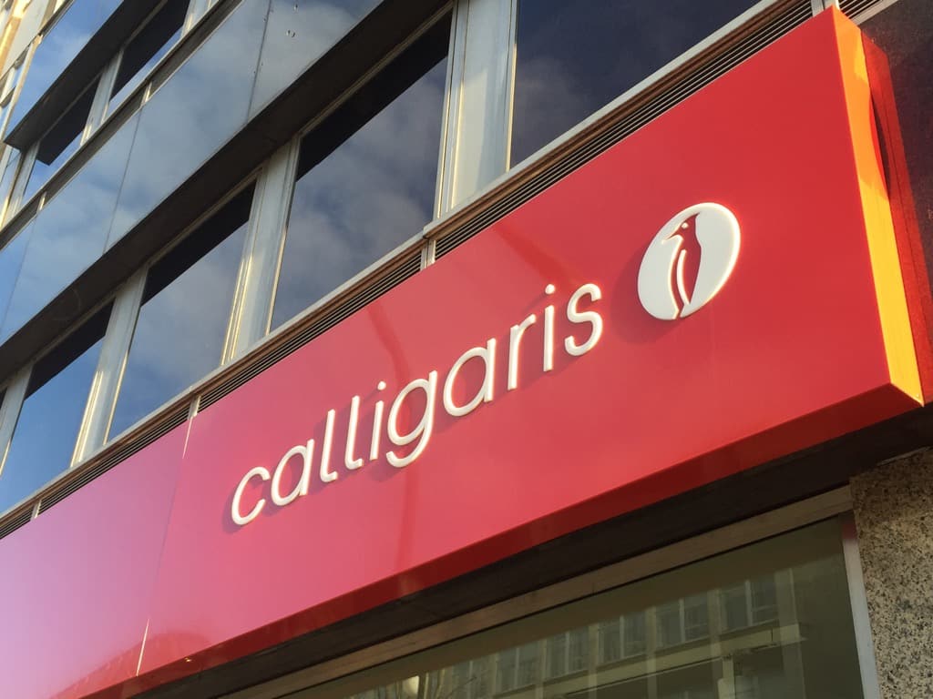 Sign Design Hints Tips 07 East Herts Signs.
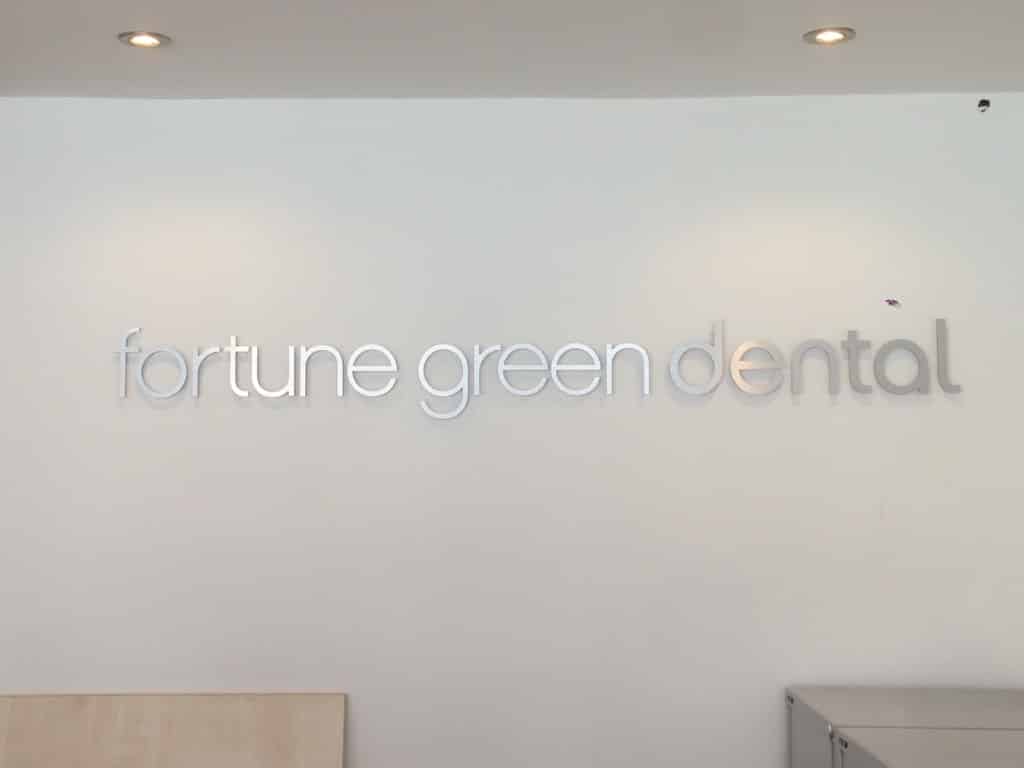 Sign Design Hints Tips 08 East Herts Signs.
 Sign Design Hints Tips 09 East Herts Signs.
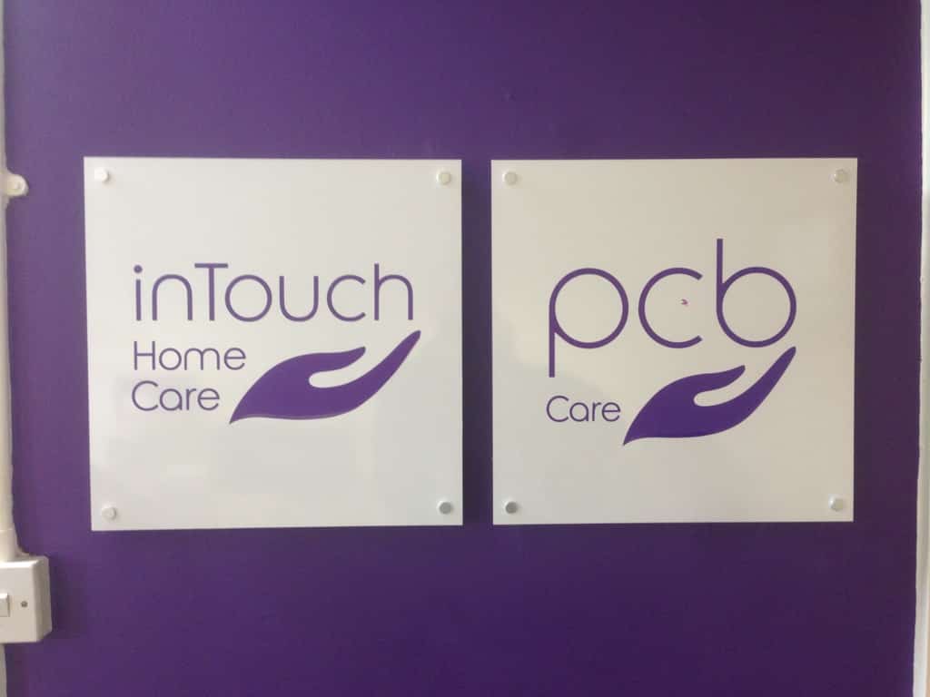 Sign Design Hints Tips 10 East Herts Signs.
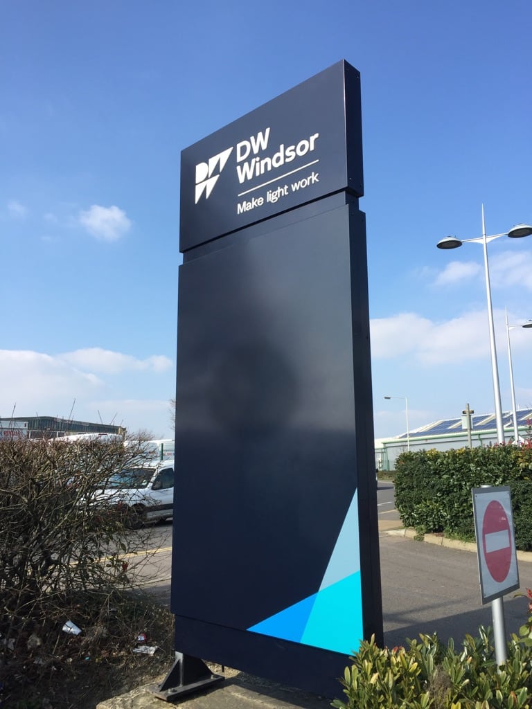 Sign Design Hints Tips 11 East Herts Signs.
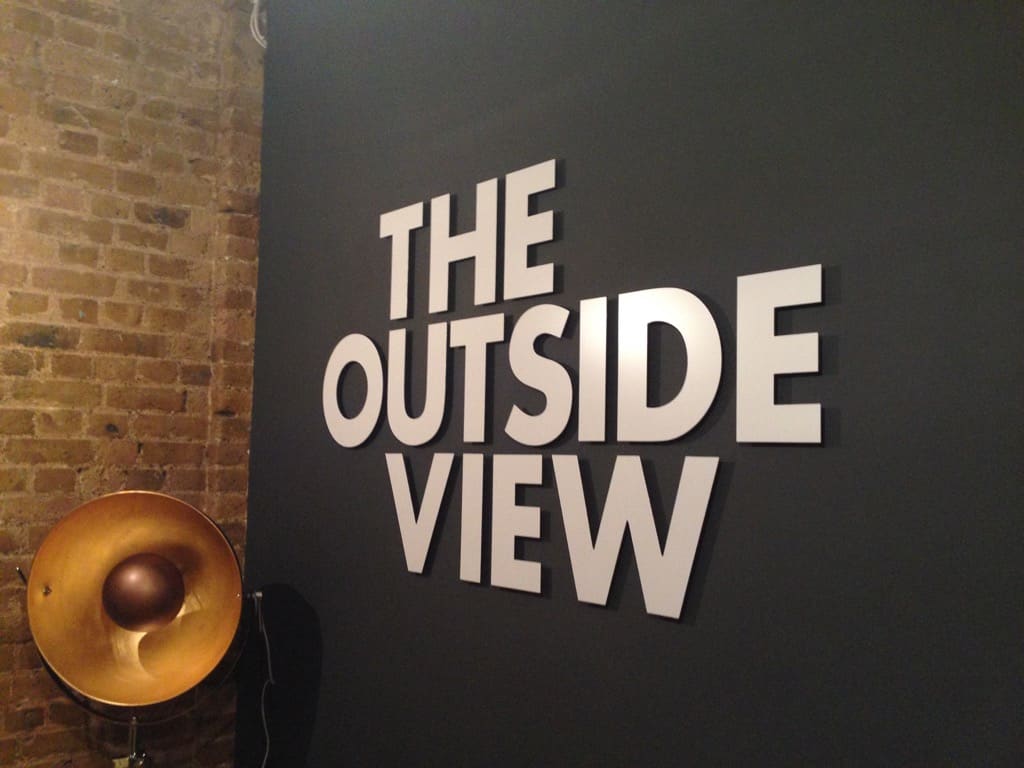 Sign Design Hints Tips 12 East Herts Signs.
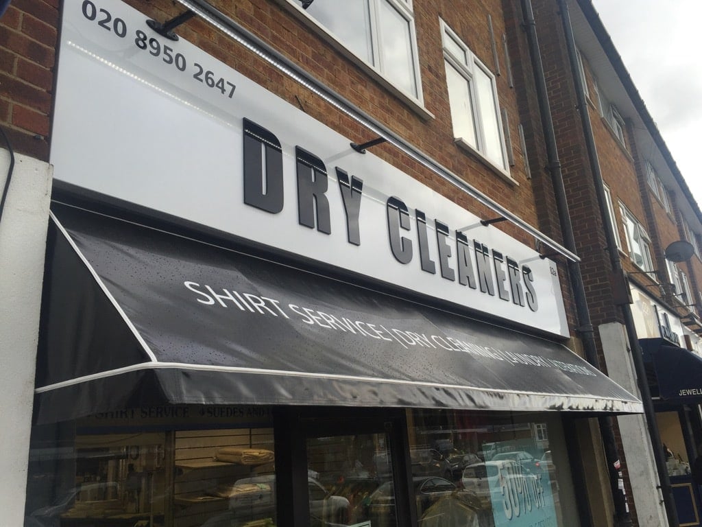 Sign Design Hints Tips 13 East Herts Signs.
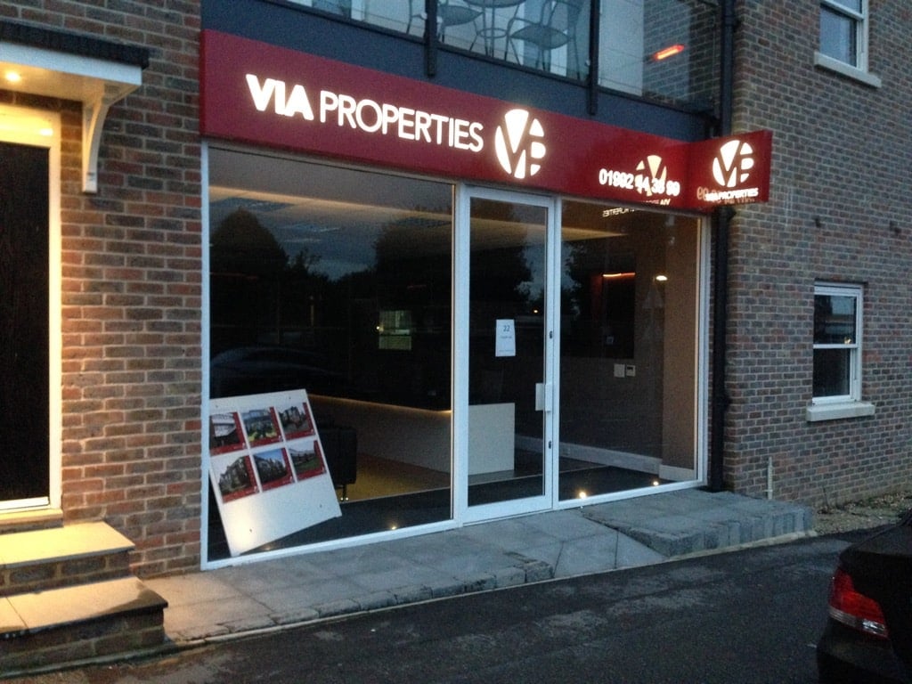 Sign Design Hints Tips 14 East Herts Signs.
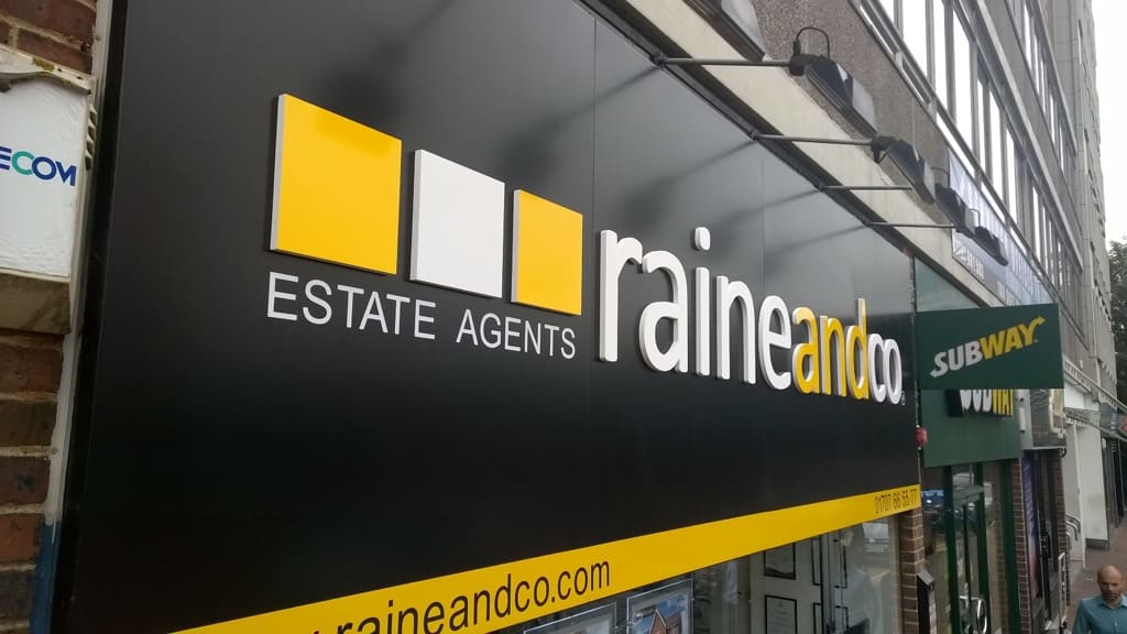 Sign Design Hints Tips 15 East Herts Signs.
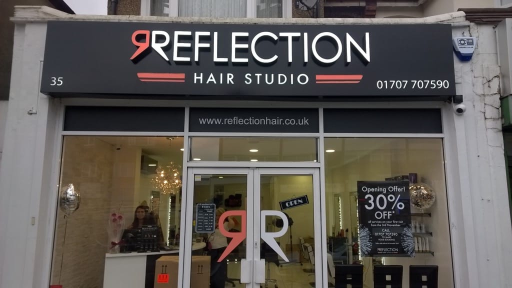 Sign Design Hints Tips 16 East Herts Signs.
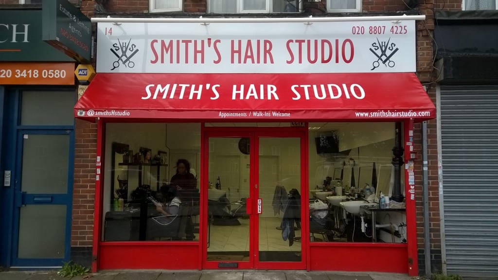 Sign Design Hints Tips 17 East Herts Signs.
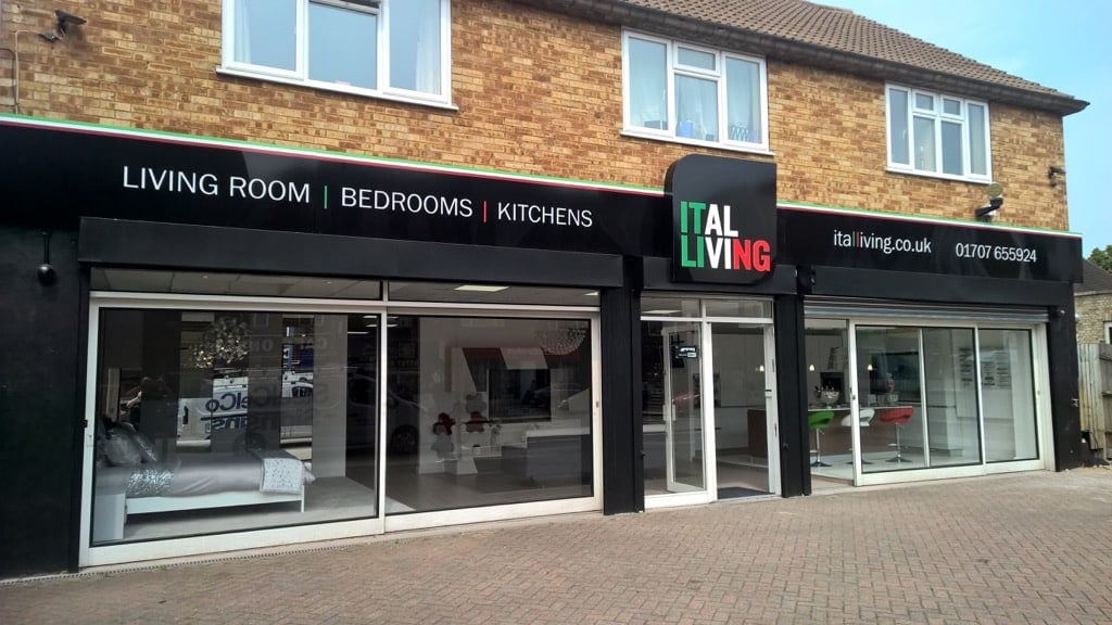 Sign Design Hints Tips 18 East Herts Signs.
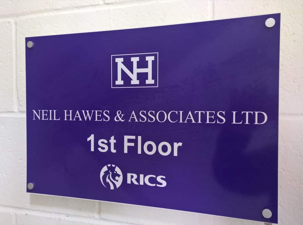 Sign Design Hints Tips 19 East Herts Signs.